

A frontend refresh and backend overhaul.
Q3 2023
HYM Web UX Refresh
Introduction
Client Overview
Healthy Young Minds (HYM) is a teletherapy service provider with services ranging from child development milestones to adolescent mental health. Their team was facing two major issues: non-unified website design system and a slow, bloated backend editing experience.
Objective
I was brought on to this project to give their website a UX and visual design facelift while also working to organize and simplify their backend to streamline future website management.
Process
Design
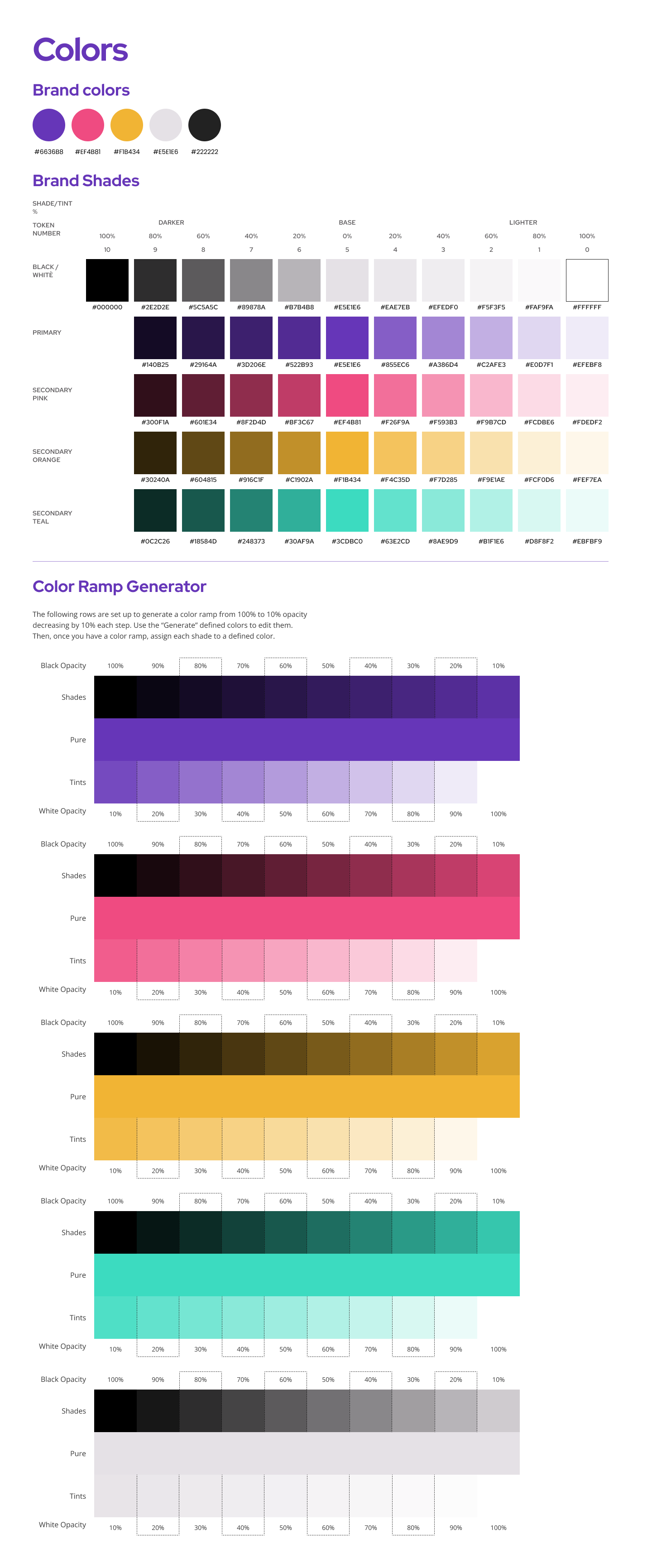
On the design side, I worked closely with stakeholders and SEOs to make sure that my proposals fit within the brand guidelines and any changes to website structure and design would not have a negative impact on SEO.
Along with their original brand guidelines, HYM provided other sites that they admired for inspiration, including understood.org, keepertax.com, and brightside.com.
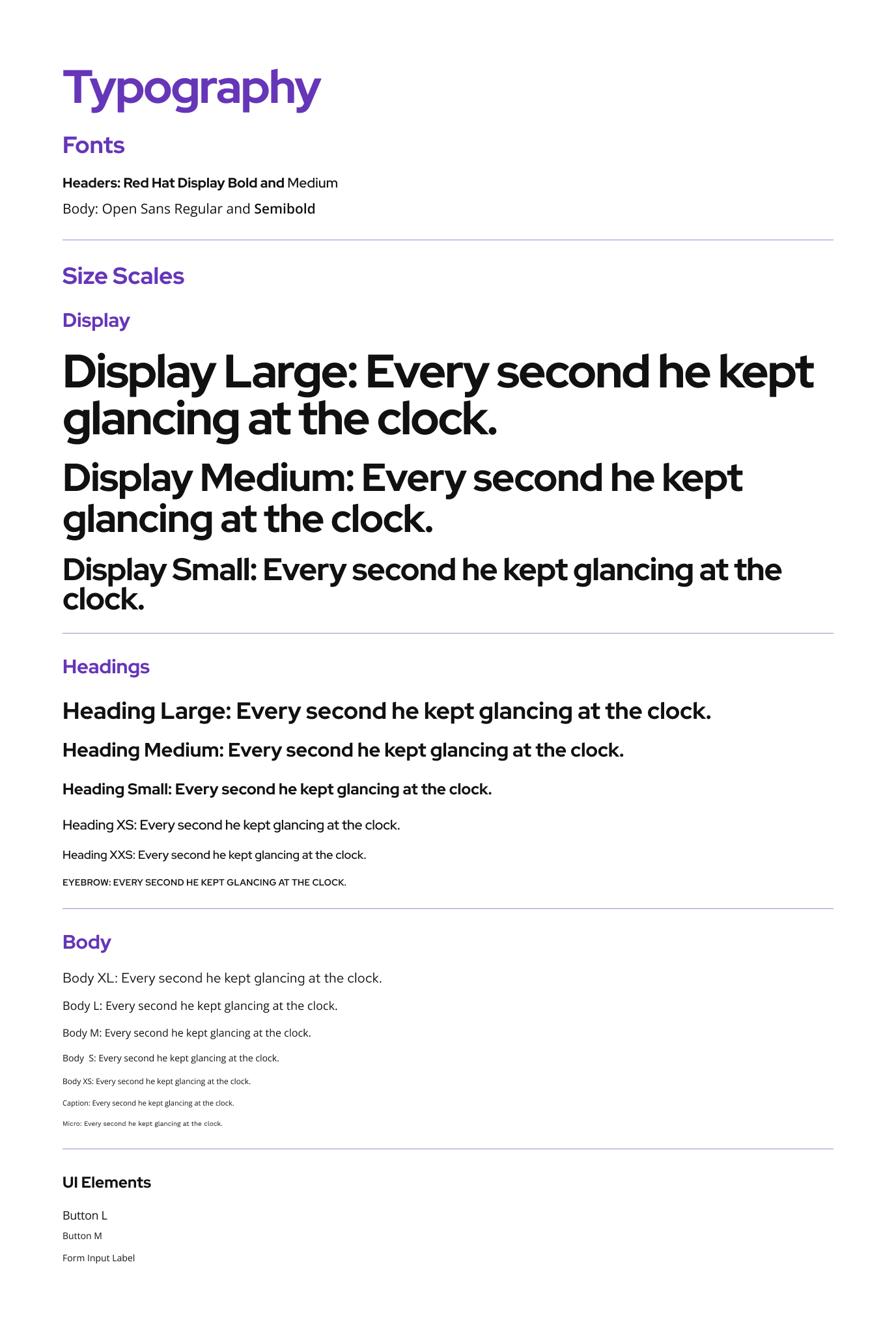
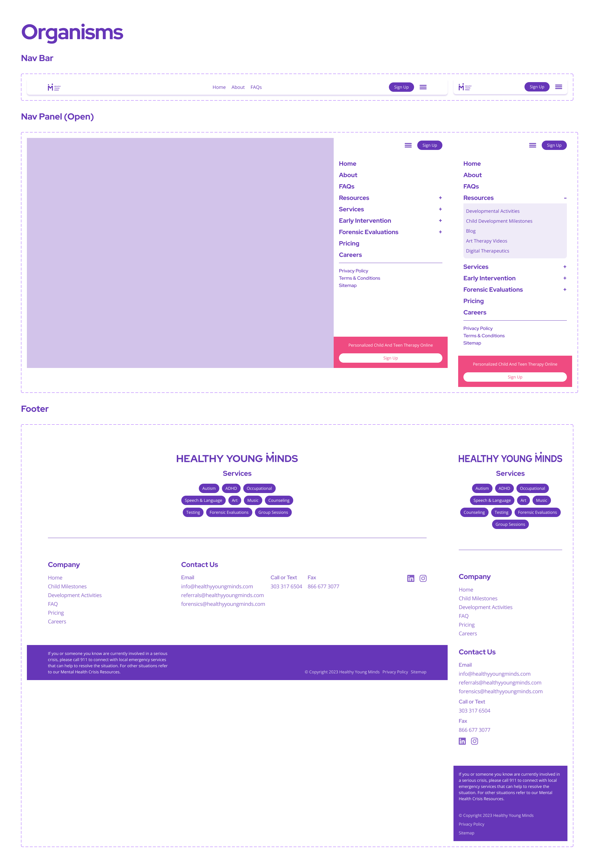
I took an atomic design approach to create a design system for their website with Figma. Once this was approved, I used this system to redesign their pages.
Web Dev
The backend web editor was slow and disorganized, so many of the changes made to toptimize the workflow moving forwards were not visible.
We planned for a progressive rollout rather than deploying a totally new site all at once. The benefits of updating the website piecemeal is two fold: (1) search engines have time to index new changes while parts of the site remain the same which keeps SEO high and (2) the HYM content and business teams can work in tandem to approve smaller designs without getting bottlenecked.
I architected various page systems including page sections, metadata, and CSS styles such that the styling and UX for all the old and new pages would remain consistent and be centrally managed.
Challenges
A Disorganized backend
Sifting through scores of pages and bits of information was tedious and I had to pay attention to make sure that each page loaded required resources correctly.
Web styling
There was no standard or global stylesheet for the website. This meant that each div and peice of html were pretty much hard coded. To overcome this, I implemented a global stylesheet that leverages CSS variables and atomic classes to handle global and repeating layout and visual styles.
Results
Creating and implementing a web design system onto HYM's website helps with UX to provide a more consistent visual interface. Updating the previous designs to fit a more refined and modern brand helps create user-business trust as the new visuals look cohesive and designed rather than slapped together at the last minute.
By converting the blog posts from individual pages to a centralized collection of content, the site is more responsive when making edits. Further, having the content in this collection also streamlines the process of editing and adding new blog posts while also making it easier to render blog post links elsewhere on the site. This is a huge win as HYM's SEO strategy relies on these blogs for organic rankings.
The effects of my work go further than just a better looking website. According to Google Search Console, four months after rolling out incremental website changes has resulted in a 288% increase in clicks, a 146% increase in impressions, and a 62% increase in click-through-rate.