A UI UX excercise.
Q3 2020
Mantra Magazine UI
Overview
I was given a client brief for a health and lifestyle magazine targeted to 25-30 year old men with the following pain points:
- Searching for inspiration about lifestyle, health, news, music, movies, etc
- Get bored with uninspiring content
- Hate having to return to websites to check for new articles
The goal was to create a blog-style website and the project was broken down into five main sections: research, information architecture, wireframing, brand styling, and prototyping.
Below is a summary, however you are free to read the full project write up.
Research
The main sites that I researched were GQ, Men's Health, Vogue Arabia, and Caleo to compare and contrast what they include in their websites and how they are laid out by I annotated their sites on mobile and desktop for both the home pages and an article page. This invision freehand outlines the details. I then summarized the layouts in text for different sections (header, feature, sidebar, etc), drawing attention to what I thought worked successfully, and then making a list of features to include in Mantra's layout. Of the four blogs that I looked into, only Caleo was an exception to the standard landing page design so I discuss this separately.
In addition to getting a lay of the land by looking at these blogs, I passively took note of the differences in their aesthetics. Most noteworthy were the boxy and constricted design of GQ contrasted with the spaced out and largeness of Men's Health. This made me suspect that Men's Health's target audience is substantially older than that of GQ's. The 2019 Men's Health media report supported this as the median age for readers about 44 for Men's Health is and 36 for GQ. This is relevant as the target age for Mantra is 25 to 35, so the visual style needs to reflect this age group.
Another clear difference was in the copywriting. GQ's article titles are sardonic and mysterious, but do not reek of clickbait. They are relatable and almost memeable. Men's Health's writing style on the other hand is to the point and more plain. Thus, creating a colorful voice for Mantra seems like it would better suit the target demographic.
Thoughts on the Article Pages
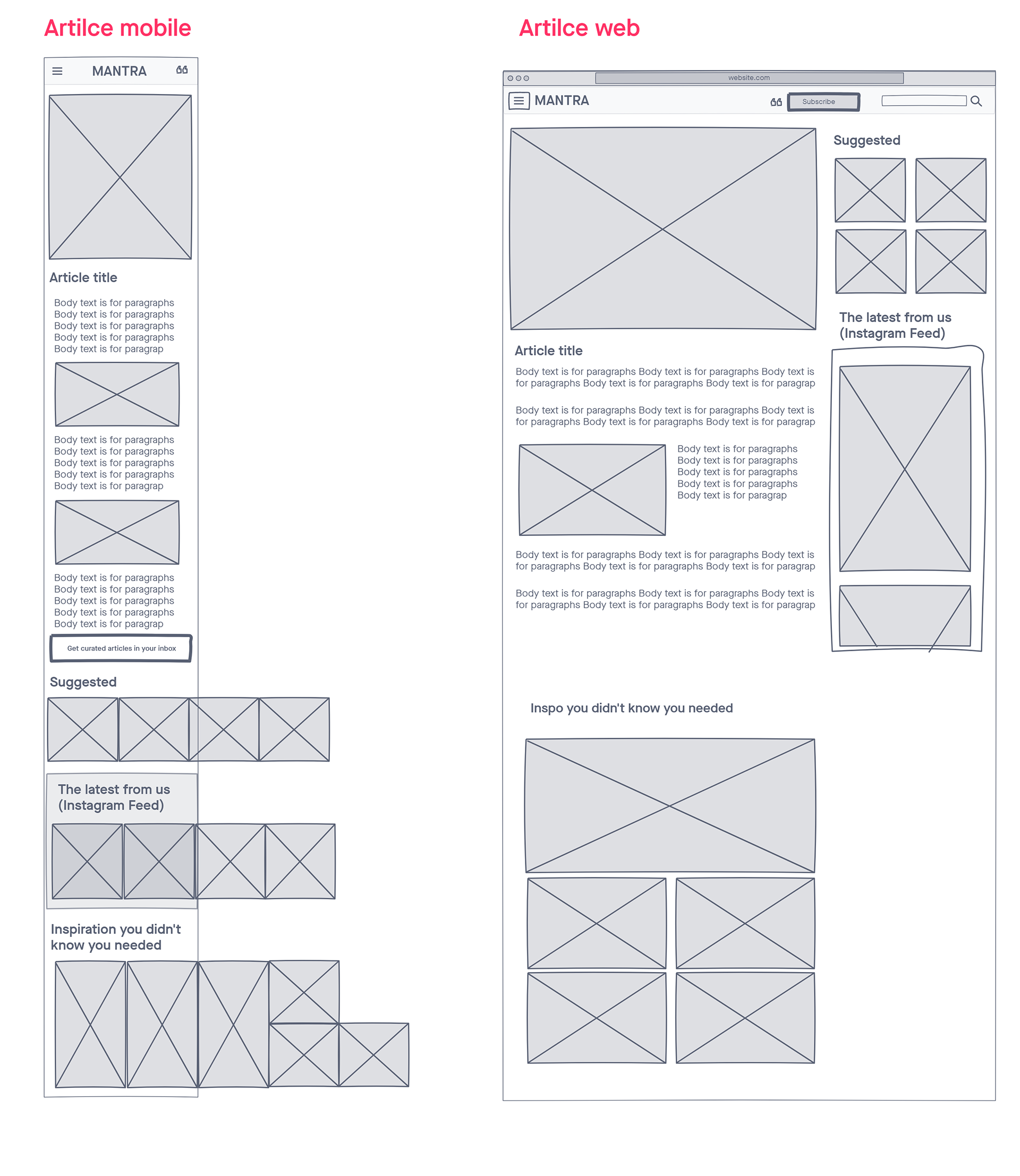
Though it is more standard to use the order: title, author, image, text, GQ's starts with a bold image. I know from the visual the general topic of this article, giving me a better idea of what to expect. Plus if I clicked a link, it probably had the title anyways.
The body text of articles are split on a three column grid with the text taking up two of them.
Attention spans are short. Shorter text broken up by large images might be an effective strategy of making the articles more digestible and reducing boredom.
As a sidebar or below the article, there is a section of links to other articles. Collections could differ from most popular, other relevant/categorical articles, or recommended, newest. To-do: pick collections that will achieve user goals.
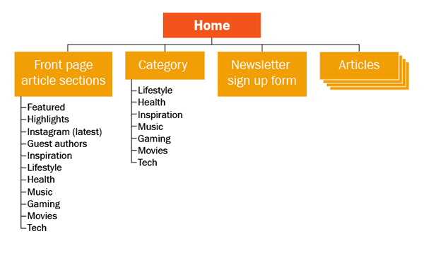
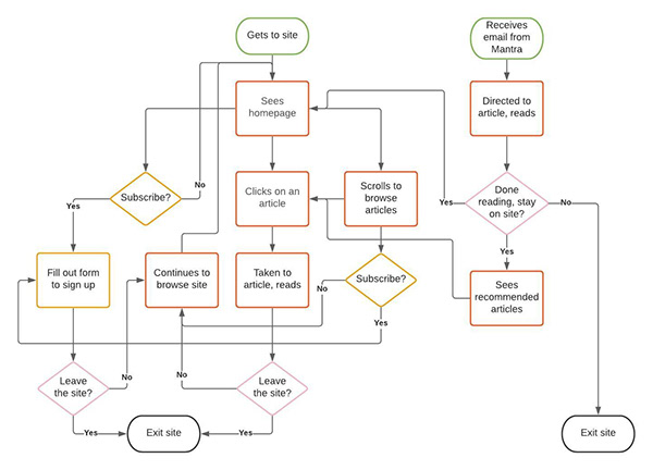
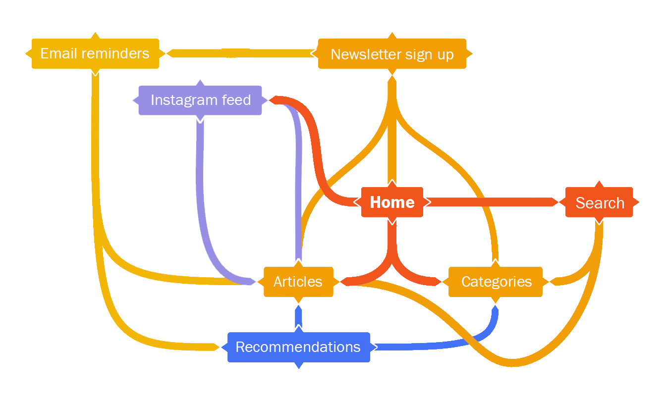
Information Architecture
I digramed the client's requirements and feature list to make better sense of it and to see relationships between these data points and possible user interaction by sketching a concept map, user flow diagram, and site map once. Of course, I also made some lofi-sketches to iterate over some possible layouts for web and mobile.
Wireframing
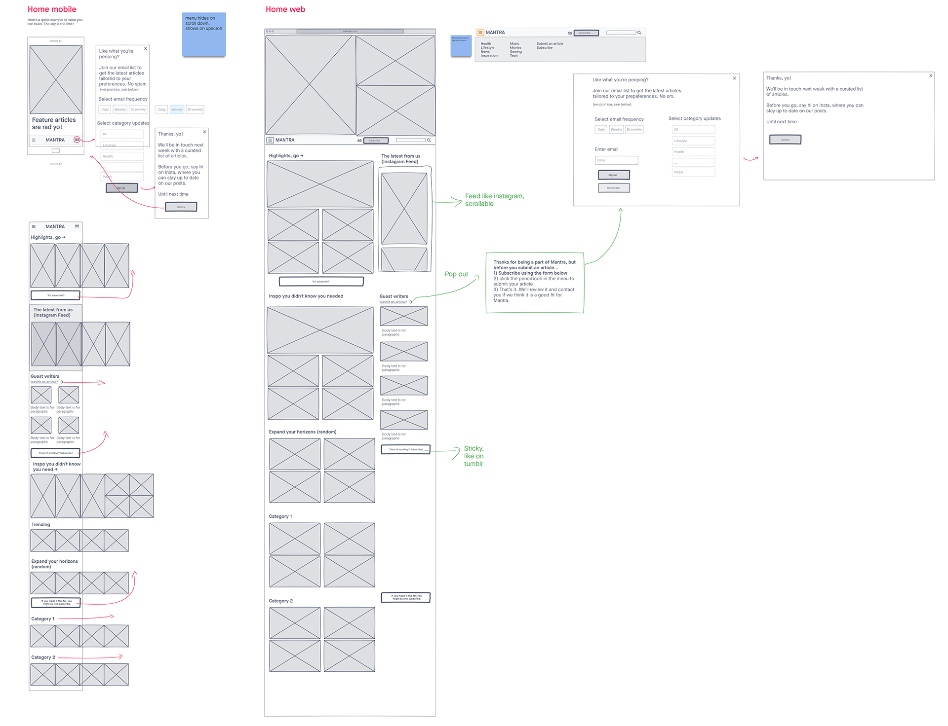
From the sketching phase, I narrowed down on the layout design by creating digital wireframes with invision. In addition to getting a better direction of the design, this phase helped visualise interactions such as bringing up the menu, subscribing to the newsletter, and scrolling through articles.
Because one of the user's pain points is not wanting to return to search the site for new articles, the option to subscribe to the newsletter should be clear. More importantly, actually signing up for this should be as painless as possible. For the former, the subscribe button will appear multiple times as the user scrolls, but each time with different text, progression from "Yo! Subscribe?" to "Tired of scrolling? Subscribe!" to "If you made it this far, you might as well subscribe." The form will only take the user's email and a few preferences such as how often they want Mantra to email them and which topics they are interested in. It should be made transparent what will be communicated to the user.
Instead of having a "Latest" or "Most recent" section be labeled so explicitly, I decided to include a section with Mantra's instagram feed to automatically show their newest posts about articles. Not only does this satisfy the client's requirement, but it also helps users stay up to date on Mantra's content without returning to this site, since there is an option to follow Mantra on Instagram.
To aid the user in navigating the homepage on mobile, I minimized vertical screen length by making article sections horizontally scrollable. This is to help them navigate through the section without seeing tons of articles. Since user's hate returning to search for new articles, this feature aims to reduce searching time and thus reducing friction in finding articles.
Style Guide
Mood: bold, strong, modern
Font: Franklin Gothic
Corners: sharp, no radius
Colors:
- Red: #F2541B
- Orange: #F29F05
- Yellow: #F2B705
- Black: #1F2933
- Grey: #616E7C
- Light grey: #F5F7FA
Prototyping
I created web and mobile prototypes of the home page, article page, menus, and sign up process with Adobe XD. Though the web and mobile versions are interconnected, there are links to several flows for quicker access.
For both web and mobile versions, the page loads with the menu bar at the bottom of the page. Once the user scrolls up, the menu bar is intended to stay fixed to the top of the page. To get this effect in XD, I created two versions of the homepage, one as if the user came to that page (the menu at the bottom) and on where the menu is actually fixed to the top. In the former, the menu is not fixed at all. The fixed menu is the intended behavior.
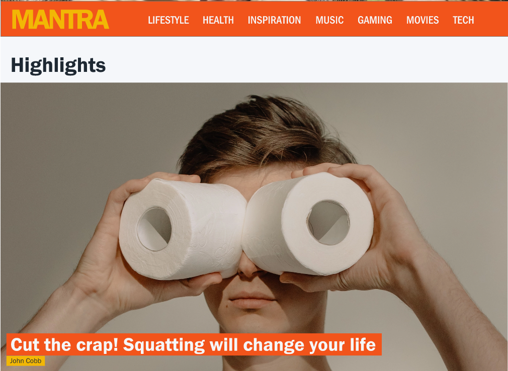
The article used as the example is the "Things I wish I practiced when I was young." clicking or tapping on this article from the homepages will lead to the article page. The "sign up" buttons will overlay the newsletter sign up screen.
On mobile, the menu is brought up by tapping the hamburger menu. It works on both the "landing" and "menu below fold" versions (see below in deliverables).