A UX and web design project.
Summer 2018
Online Master's UXR and Web Design
Background
The University of Colorado Department of Electrical Engineering (EE) is launching the university's first online master's degree and certificate program. Although the courses for the Online Masters of Electrical Engineering (MS-EE) program are filmed by CU professors, they will be hosted on the MOOC platform Coursera. For the first cohort, interested students will apply through a Technolutions' Slate form. Information about the MS-EE program is on the official EE website.
As the UI/UX intern at the University of Colorado Boulder's Office of Information Technology, I was tasked with redesigning a portion of the EE website to streamline enrollment and understanding of the MS-EE program. The process involved leading user research to guide user experience and web design decisions.
The Problem
This project began when the UX team did a round of testing for the online degree's enrollment form process. For this initial round of testing, we used internal employees as participants to get a general sense of how user-friendly the process was. It became clear to us that users were confused about how the program worked, and though the "How it Work" page on the EE site helped, the process was rated with a SUS score of 60, which is considered to be "ok."
The biggest problem to user's understanding of the MS-EE program was that the information was split awkwardly between the EE site and Coursera, and both have their own conflicting policies. There is not enough clear and consistent information on the EE site. Since looking at Coursera was problematic, we wanted all the information to be available on the EE site.
Changes Made
I went through the site and revised some of the content because there was a lot of irrelevant text. I pulled questions from the Webinars that the EE offered and created a FAQ page, knowing that students will be confused, and their alternative would be to contact someone in the EE department. This would be a hiccup in their experience and would also strain the EE department employees.
From user testing, I found that participants wanted to see detailed information about the courses. Although Coursera has this information, I pushed to have it on the EE site because of the awkward split of content between the two sites. I added pages to include the information that is on Coursera, such as which specialization they belong to, learning outcomes, instructors, and syllabi.
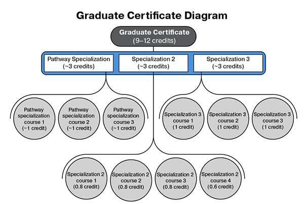
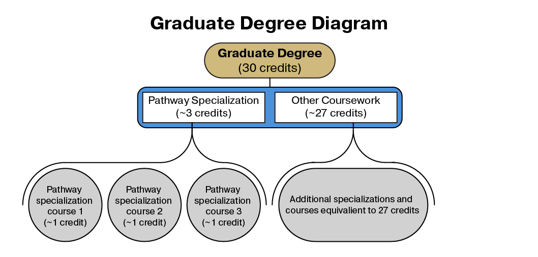
Again, since users were confused about the general structure of the program (despite and because there was so much text), I decided to add graphics explaining the degree and certificate requirements.
With these changes in place, we were ready to test it with students.
User testing with Students
I ran five user tests where I gave them a series of tasks to complete that were grouped into different scenarios, such as: "You are interested in finding out more about how to get the master's degree they are offering. Find the cost of the degree, how you would get admitted, the pacing of the classes, and the requirements for the graduate degree." Other tasks included finding information about the certificate, coursework for individual courses, previewing classes, and switching to for-credit options.
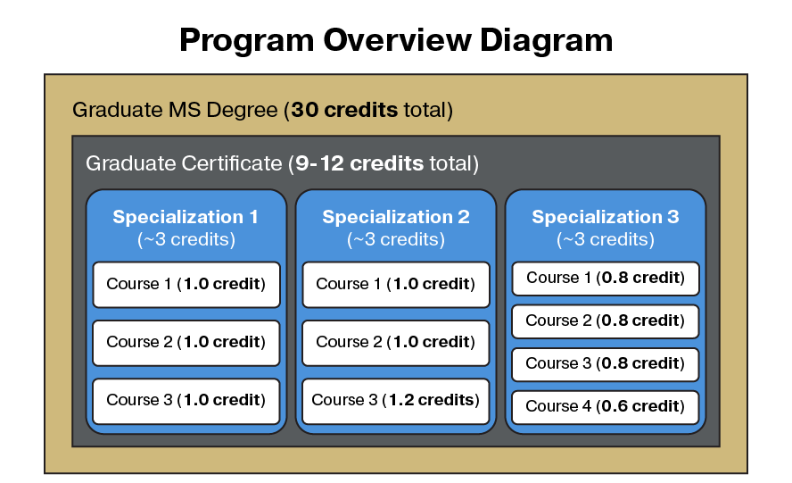
The site was rated with a SUS score of 74.5 which is considered good. All participants liked the course pages and loved having a syllabus provided. They also found the degree and certificate diagrams easy to understand. Of course, there were problems.
Problems
Comprehension
Three of the five students were international students and it was clear that some of the vocab used on the EE site impeded their understanding of the program. Two of these international students did not understand what "specialization" meant in this context, and in general this concept and its relationship to pathways and courses was misunderstood.
Site Structure
The biggest issue is that a users felt that the "How it Works" page was just a better formatted version of the home page. On the focus area pages, it was apparent that the participants did not understand the relationship between specialization and courses due to its organization.
Proposed Solution
I made some changes and took the design to the EE department. We collaborated to find new solutions and tweak existing pages.
We agreed that the "How it Works" page should be the new homepage and we renamed it to "Overview". I replaced the expandable content (a WebExpress feature) with descriptive headers to help users locate chunks of information. In addition, the FAQ was placed below the this content, making this page focused and content rich.
The curriculum page has been updated to show all 6 focus areas, and other than reducing the text at the top, it is pretty much the same.
To solidify the relationship between specialization and courses, I reformatted the "course structure" header and labeled it "courses and specializations." On the Focus Area pages, I restructured the page with headers for "specializations" and "certificates" and changed wording to make the specialization/course relationship even more clear. When talking to the EE department, we explored other options on how to separate specializations and certificates, but we found that anything else we tried introduced things that we thought would confuse or overwhelm users.
From testing this version of the site, we found that the degree and certificate graphics on their respective pages were very helpful, and the additional text also helped fill in the gaps that the graphics failed to communicate.
Although we only has three student participants in our last round of testing, the site scored a SUS score of 72.5 which is still considered to be good. With such few participants, this score should not be taken too seriously. However, during this last round of testing, users were not as visibly confused and completed tasks much quicker and with more confidence than in previous tests.
What is written above describes only a fraction of what I did. If you are truly interested, you can view the full design process document on DropBox.