.png)
.png)
A minimalist task list for life maintenance
Q2 2024
Task Kat App
Overview
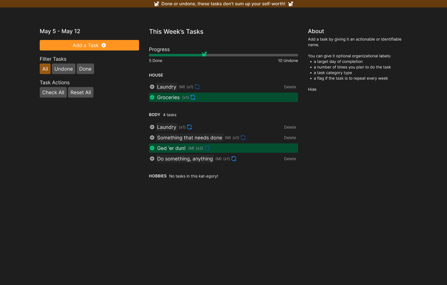
Task Kat is a minimalist todo list to help keep track of all the tasks that we have going on in our lives. Design artefacts have been made in Figma and translated into a functioning UI using Svelte.
Objective
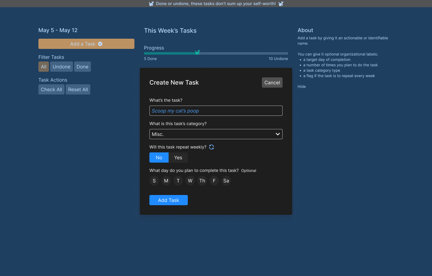
The primary objective for this project is to gain a deeper understanding of composing UIs with SvelteKit by creating a simple todo list app where users can add, edit, and delete their weekly tasks. Version one of this task list app will be focused on UI and functionality, meaning that the data used in the list will be localized to my machine.
In the future I’d like to extend the functionality and learn how to handle data from an API once the core features and UI are all working.
The Problem
In the past, I have struggled to remember to do those things that give me joy and those other things that I call ‘life maintenance’. One way I’ve found success in organizing a balanced week for myself has been with a basic todo list. I tried Bullet Journaling (BuJo) in a physical journal but couldn’t quite get the habit to stick. The best part of the BuJo method is the flexibility and usability. It takes almost no effort to defer a task to next week, check a task off, or add a new one to this week’s list. I tried keeping a digital todo list, but I ran into issues of creating a scalable and comprehensive system with a basic note or text editor.
Task Kat attempts to solve the problem of a weekly task list that is flexible by creating a weekly-repeating task list in which the user can plan and track intentional, important, and urgent tasks.
Process
Prototypes
Before I even thought of creating a Svelte project, I tried to create a digital task list using Notion.
Prototype 1
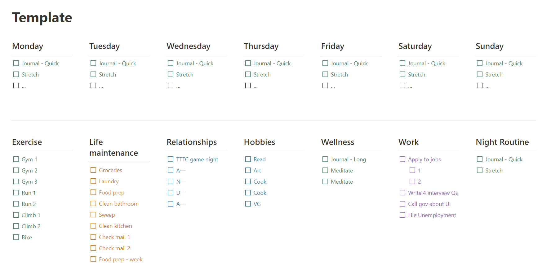
My first attempt focused on creating an easy and frictionless day-to-day experience so I started with just a basic todo list broken down into 5 categories: exercise, errands, relationships, hobbies, and wellness.
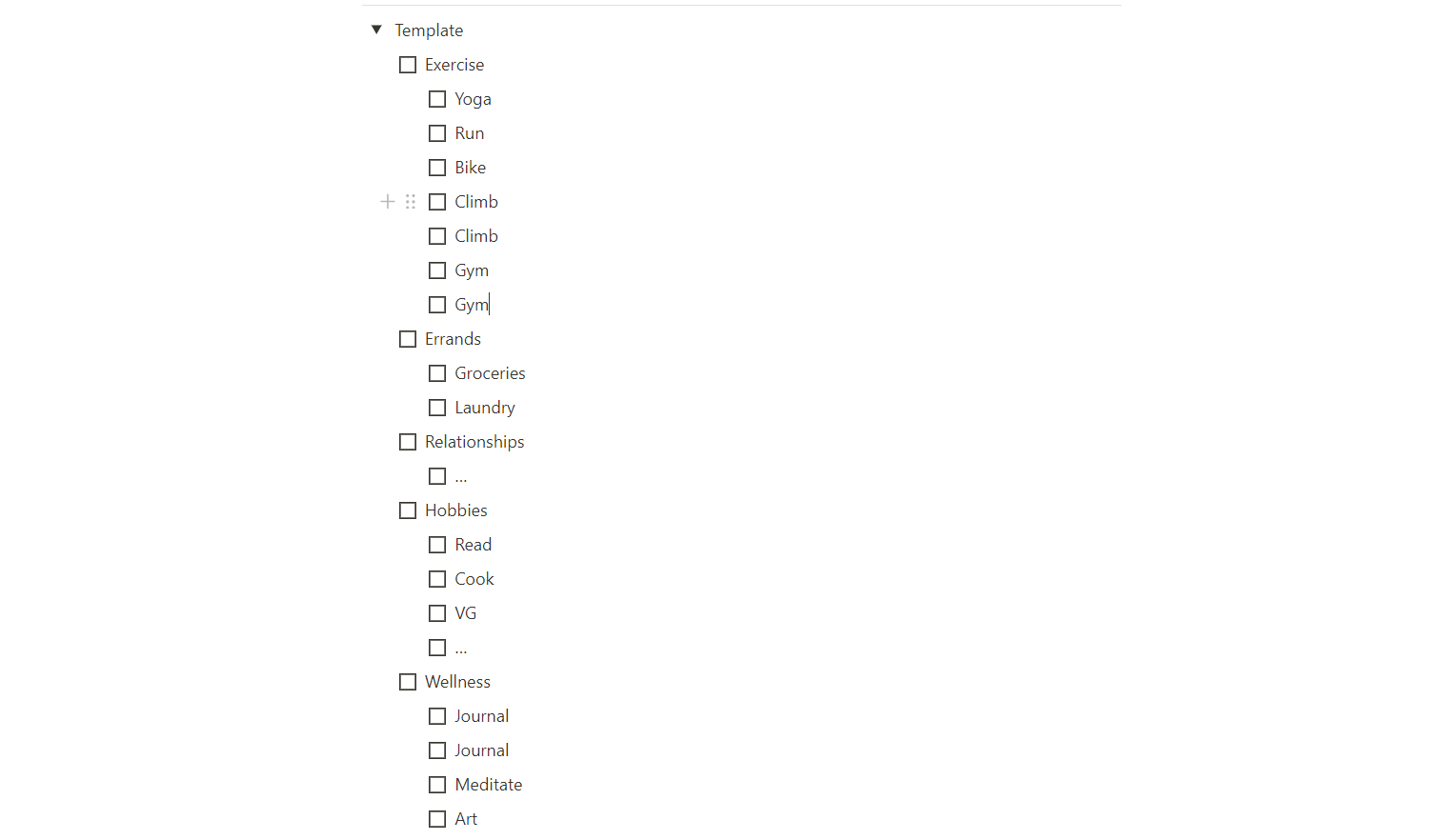
Since it was in Notion, when the user wants to add another item, they just hit the enter key and it
creates a new line. They can indent items under the category task item to organize them visually.
I created a basic template that I could duplicate week after week, and I did so for a few months.
The pros of this method were how effortless it was to add, check, and remove an item. The cons of this method were that every week I would have to manually archive the previous week's list and duplicate the template. This became annoying and added friction into the user experience at a critical point: the starting point.
Prototype 2
For my second prototype, I wanted to experiment with a drag-and-drop task list builder. I created lanes for each day of the week and for each category, with the tasks that would repeat every week in them.
The idea would be to drag each task from the category sections into whichever day the user would plan to complete that task. I used this for one or two weeks, but it was too many interactions for a streamlined and effortless feel.
Moreover, seeing all my days and all my tasks laid out like this in a grid rather than a neat, single columned list was overwhelming. I did, however, like that I could see when in the week I planned to do a task .
I reverted back to the first prototype that I tried. I added a simple text string in parenthesis to denote the target day.
Prototype Takeaways
- The todo list should be a focused, single-column list to avoid feeling overwhelming
- Drag and drop is too cumbersome, should stick to basic keyboard and click interactions.
- Categories are mostly constant
- Automate the weekly refresh of tasks
- Including a target day helps plan week mentally
Interaction and Data Mapping
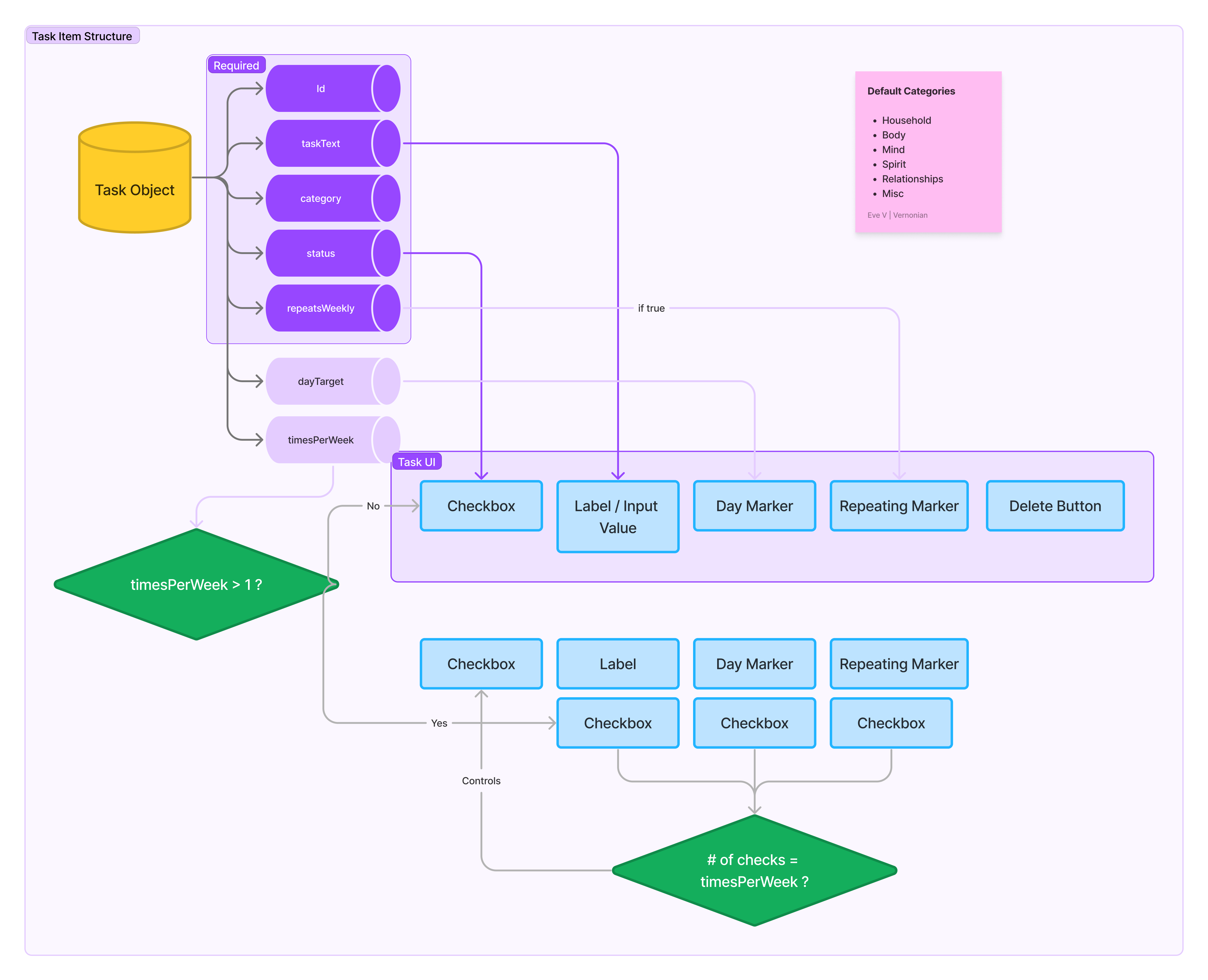
I sketched out some data and user flows to help solidify my technical understanding of how and what data will be moving around from different parts of the app.
The task object (todoTask) has the following properties: id, name,
category, status, repeatsWeekly, dayTarget, and
timesPerWeek (this property was removed for Task Kat V1)
The basic actions that the user are able to take is to edit a todo task or add a todo task.
I then also mapped out a high-level flow diagram. The main function of the app is to manage task items either by
adding a new task, changing a task's status, changing a task's repeatsWeekly value, and
deleting a task. Each of these actions is then broken down into a more detailed flow.
UI Designing
Before starting to code, I came up with a simple UI style guide in Figma. It includes colors, typography, and spacing styles (and more). I wasn't too picky with the look of the design elements because I knew that such a simple app would not have a ton of components. I mainly focused on input components and a general layout for the app.
UI Development
I created various components for UI elements and layout. The biggest challenge I faced was to ensure that the data from the original task list array was getting changed and those changes propagated down to all child components that used that data as props.
Results and Next Steps
In the future, if time permits, I'd like to extend the functionality and learn how to handle data from an API once the core features and UI are all working.