A blog website design
Q1 2024
Workmade Blog Design
Client Overview
Workmade is an all-in-one banking and accounting app designed specifically for freelancers. In addition to their main marketing site, they have a website on a subdomain that is used for helpful tax related articles, guides, and glossary terms.
Objective
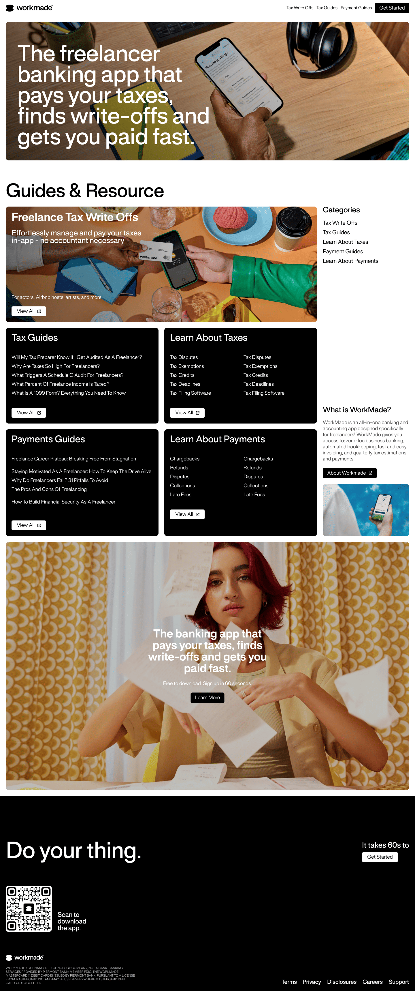
This blog-site was pretty bare-bones site in terms of visual look and feel: it was just a basic link lists for articles and boring article layouts. It was clear that this site was to serve as a platform for robots to scrape to increase organic SEO, which isn't a great look as a first impression to your company.
That's where I came in: to transform this basic HTML site and give it some visual design love based on Workmade's brand styles and existing website.
Process
Research
The client had no existing design requirements other than that it align with the current Workmade brand. Their marketing website is full of striking photography, rounded box containers, and subtle use of their neon green color throughout the layout.
With that in mind, I created a small style guide in Figma based on their existing brand, as I was not privy to their original brand design assets.
In addition, drew layout inspiration from Ramp.com, one of the client's competitors, which influenced parts of the subsequent design thinking.
Design
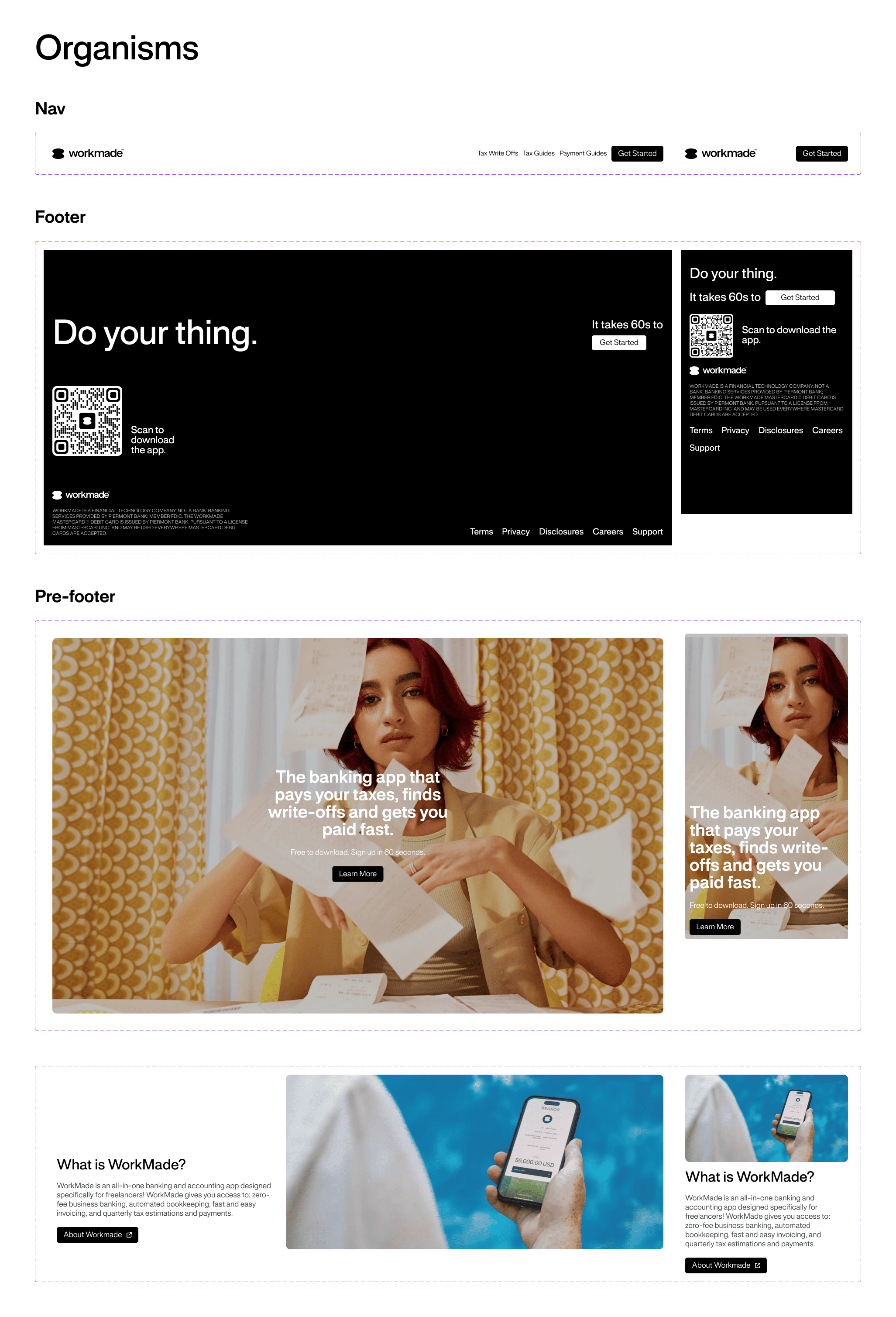
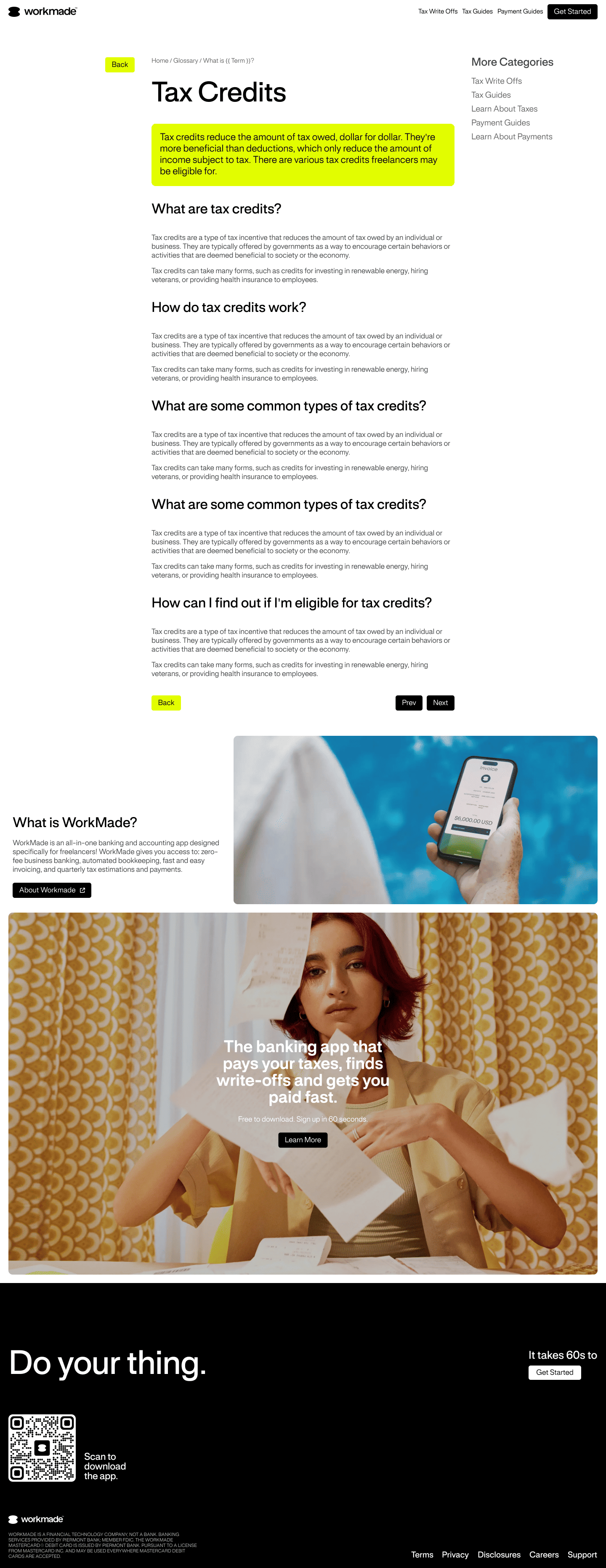
Since the simple site structure was to remain the same, I created three layout designs for the home, category hubs, and article pages, focusing on imagery and use of bold, blocky elements where appropriate.
On the article pages, I chose to not clutter the page with unnecessary images or blocks that detract from the text content. Sidebar navigations follow the reader as they scroll the page to aid in quick wayfinding.
Of course, I created mobile and desktop versions of each layout.
Development
There were no hurdles when it came to building out these designs as I translated the static mockups to the production ready website with ease.
After some QA testing to ensure it was mobile-friendly, I deployed it.
Results
The most obvious result is that the blog visually aligns with Workmade's brand. This ensures a more consistent UX as customers or prospects interact with their digital and web presence.
Futhermore, within two weeks of publishing the new design, the on.workmade subdomain site saw a 82% increase in clicks, a 56% increase in impressions, and a 116% increase in click-through-rate based on data from Google Search Console.